Bye-Bye 1998 Kitchen
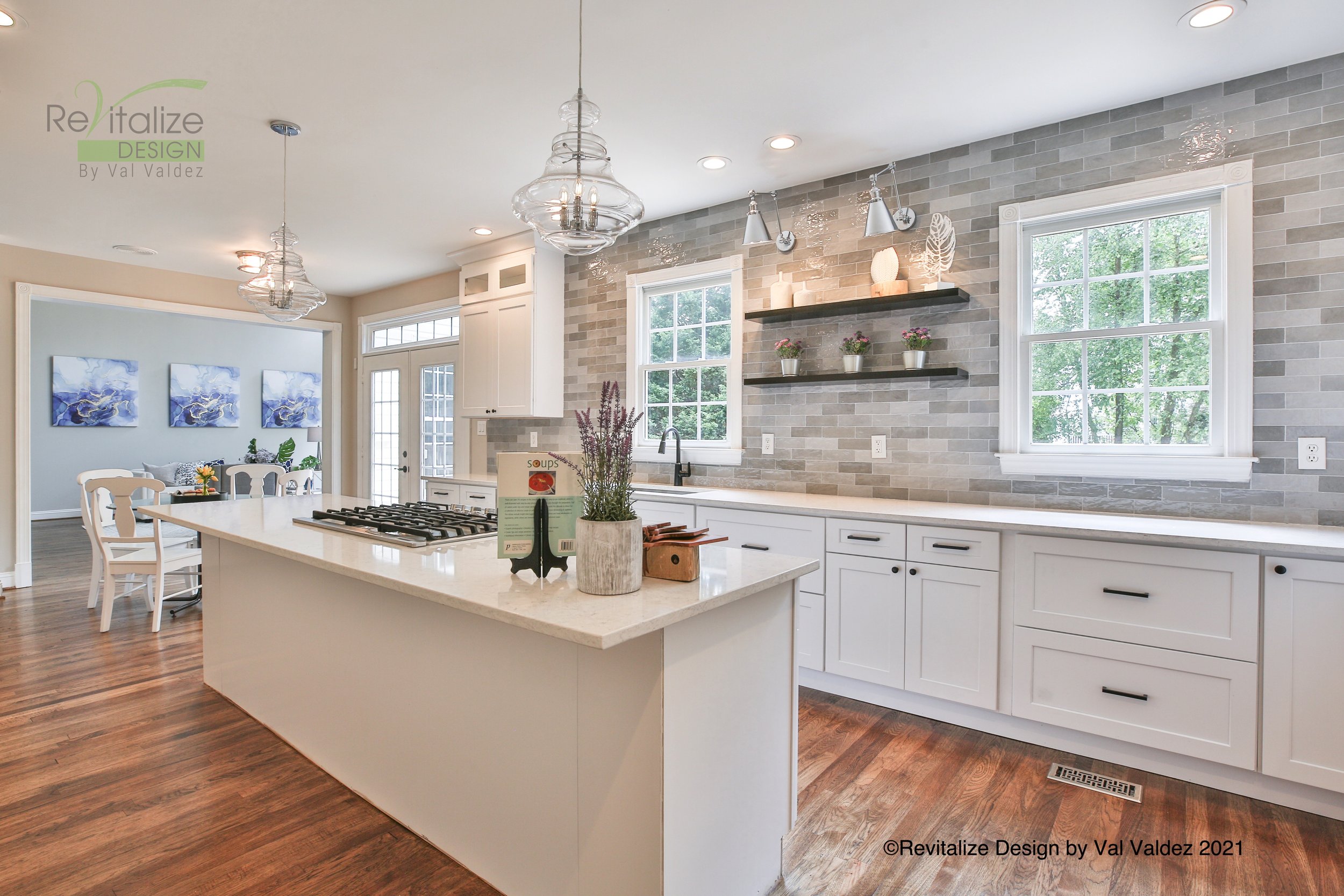
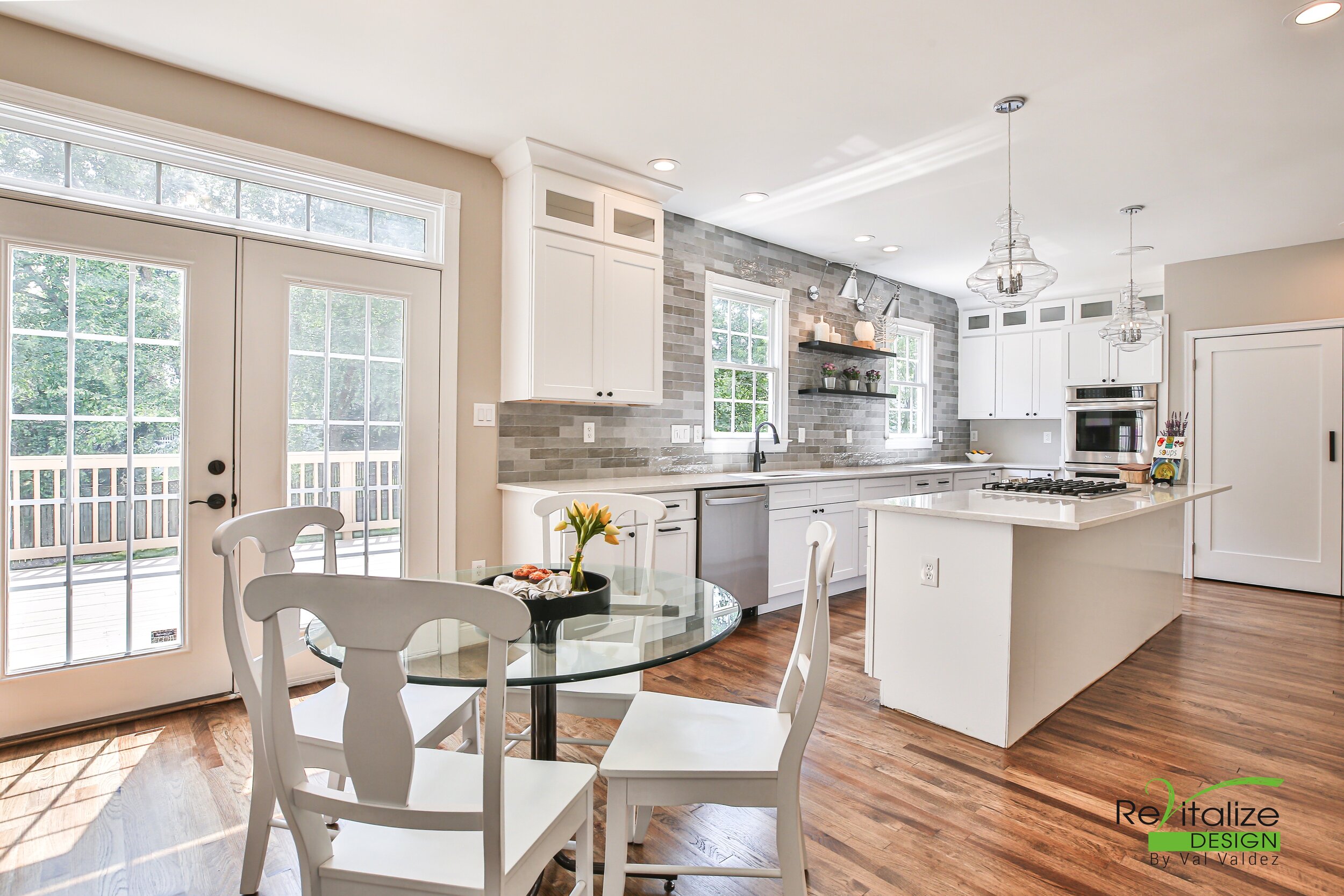
After removing the bulky wall cabinet between the two windows, the kitchen metamorphosed!
Installing a contrasting glazed wall tile all the way up to the ceiling, and adding a couple black floating shelves with angled wall sconces created a focal point which provides storage space and adds depth.
See the “before” photo below.
“Before”
The homeowners loved their home for over 20 years and wanted to honor it before moving by giving it a much-deserved makeover.
The goal of this makeover was to update the kitchen on a reasonable budget so the homeowners could leave a legacy to the next owners. The whole kitchen was gutted but all the plumbing and gas lines stayed in place to reduce costs. See more photos below.
Linear sight line
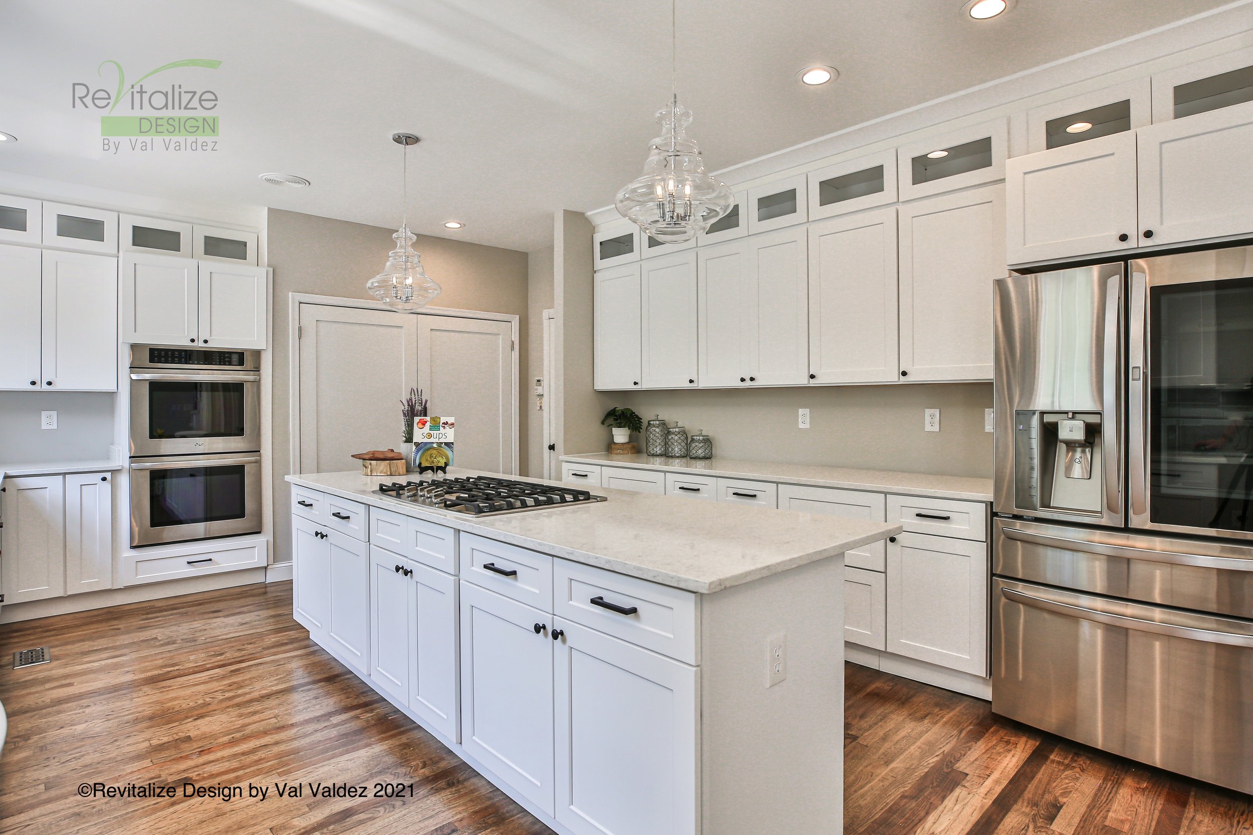
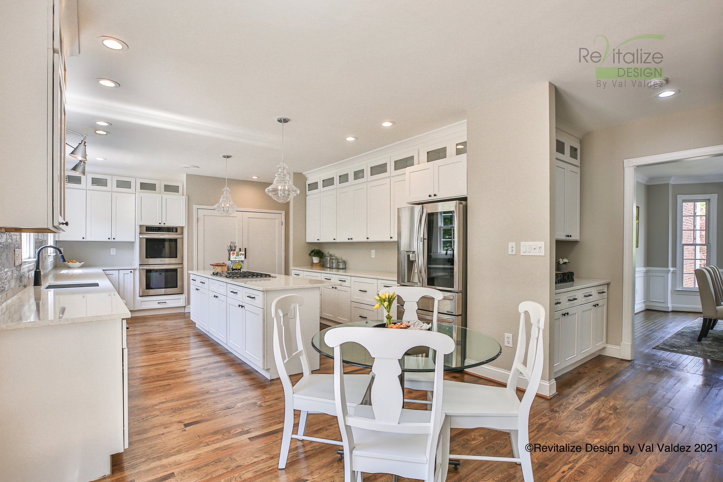
We opted for a clean design that created more usable countertop space in lieu of the underutilized desk area near the refrigerator. The old pantry was also removed to help the sight line and elongate the kitchen visually. We even saved costs on electrical by updating the existing recessed lights with pendants in the same location.
See “before” picture below.
“Before”
Same appliances, different everything else.
There were 2 storage closets in the kitchen that were united to create a large pantry.
To visually balance the room’s linear aspect, we designed the new cabinets to the ceiling and finished them with crown moulding. The top wall cabinets are glass-front and ideal for displaying collectables, cookbooks, or china. See more photos below.
Photo credit: Andrew Sample Photography


