Basement Bulkheads Become Design Elements
Every successful design starts with a calculated plan.
If you have a basement you know what a bulkhead looks like and you probably think they are hideous. My design chose to embrace these ceiling structures and put them to work. See more photos below.
Welcome!
The main point-of-entry to the basement is via the interior staircase which leads directly in front of a series of unsightly bulkheads. These bulkheads house structural beams and HVAC ducts in the ceiling so relocating them is not a viable option. My plan integrates the bulkheads into the bar design; and the use of bold colors in furniture and wall paint removes the focus from the bulkheads. See more photos below.
The client’s 1st request:
“We want a small wet bar in this corner of the basement. Not a lot of storage, but a fun and cool space to hang out.”
Designer’s initial thoughts:
“These bulkheads are so distracting, how do I make them disappear without removing them?”
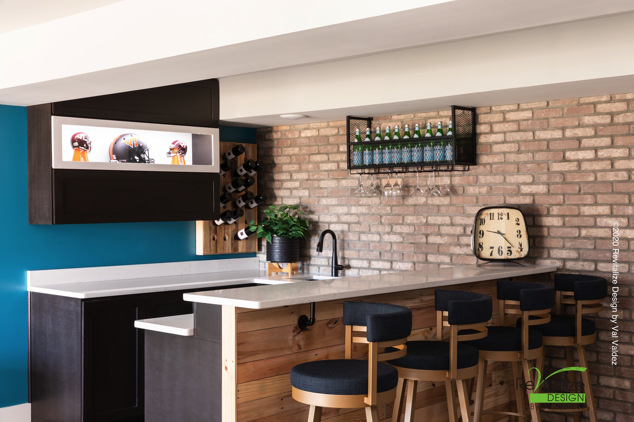
The Solution: Design a space that is functional first, incorporate the architecture into the design so it doesn’t intrude, but instead compliments. I commissioned a custom-built bar with wall cabinets that fit exactly between the the bulkheads in the ceiling, added flip-up doors for a contemporary flare; interior lighting highlights the client’s favorite sports paraphernalia; and pocket doors in the base cabinet save space behind the small bar. See more photos below.
BEFORE-AND-AFTER photo of the bar zone in the finished basement. By incorporating the unsightly bulkheads into the bar design, they are no longer an intrusive element.
The client's 2nd request:
"Make it cool!"
The Solution: The custom-made riddling rack was crafted of reclaimed wood and installed perfectly beneath the bulkhead. The front of the bar echoes that element and was dressed with a finished reclaimed palette wood. Another bar accessory that was thoughtfully created and designed is the custom-made iron bar rack which was hung adjacent to the bulkhead and artfully displays glassware and bottles for easy access adding a touch of industrial influence.
The bar alone was cool, but to kick it up a notch, we added a brick veneer backdrop spanning the length of one side of the room. This featured wall offered an authentic touch that catered to the rustic vibe and lead the way around the corner to the home theater room. See more photos below.
Brick veneer spans the length (40 feet) of the room.
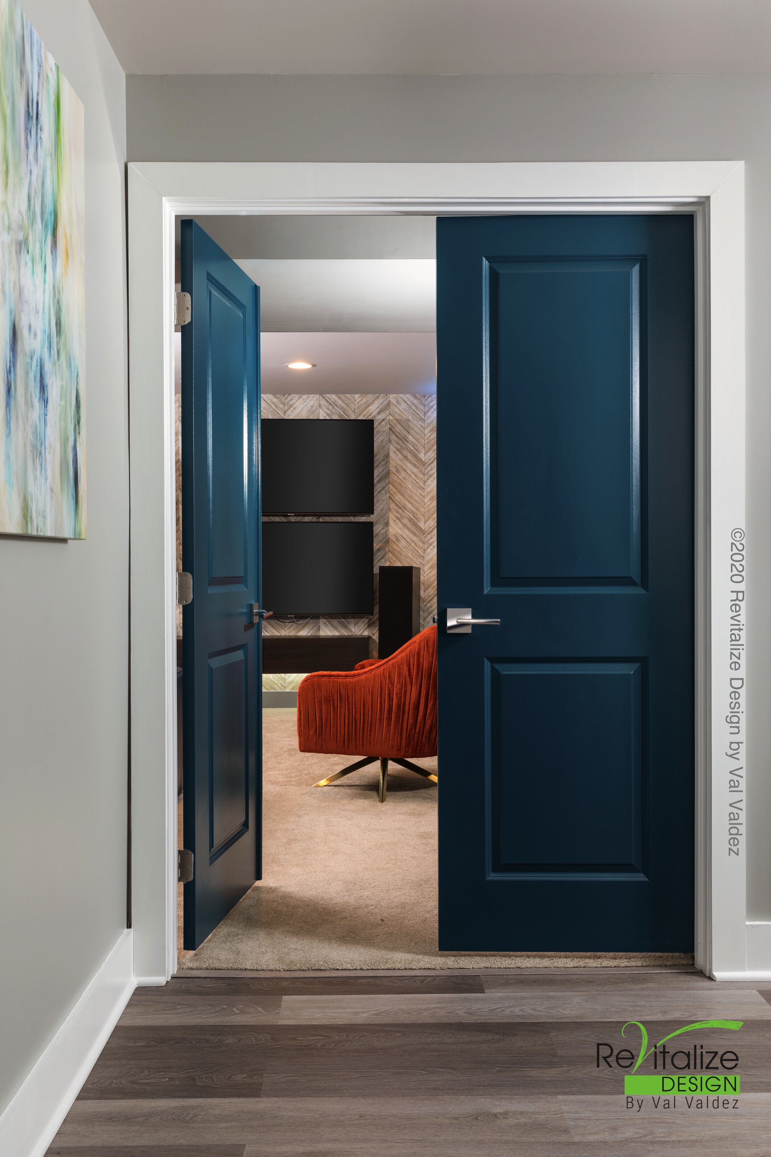
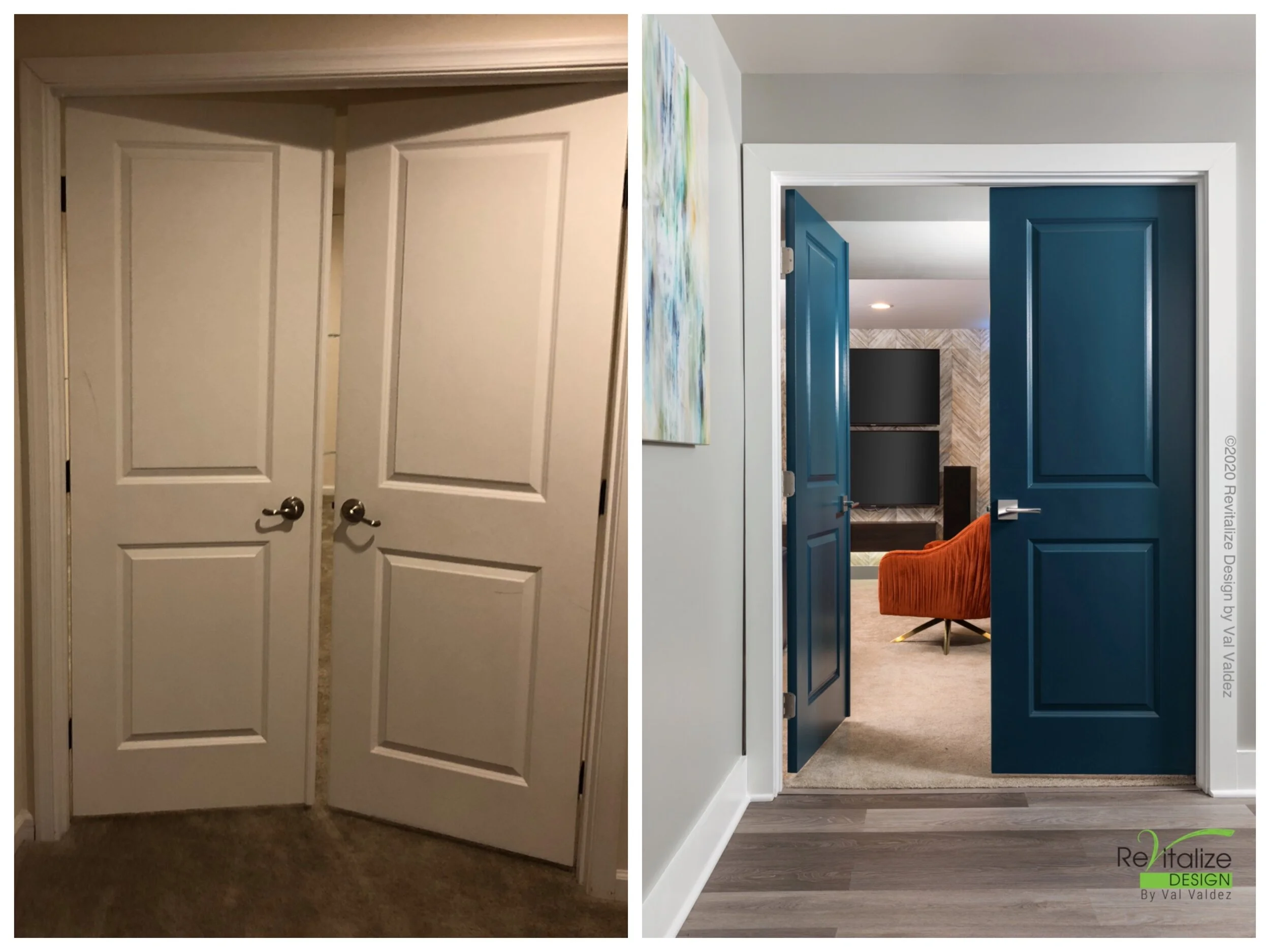
The before-and-after photo depicts the outcome of the the next challenge: to direct users to the opposite end of the basement where the media room was tucked away. This was accomplished by lining one side of the basement wall with exposed brick, hence leading one to the media room. Deep cerulean painted doors greet visitors to the media room where we added bulkheads to create a dreamy ambience for the sports and movie enthusiasts.
See more photos below.
Client's 3rd request:
"Make it fun for both kids and adults alike."
The Solution: What's more fun that color? Lighting! Well, I incorporated both.
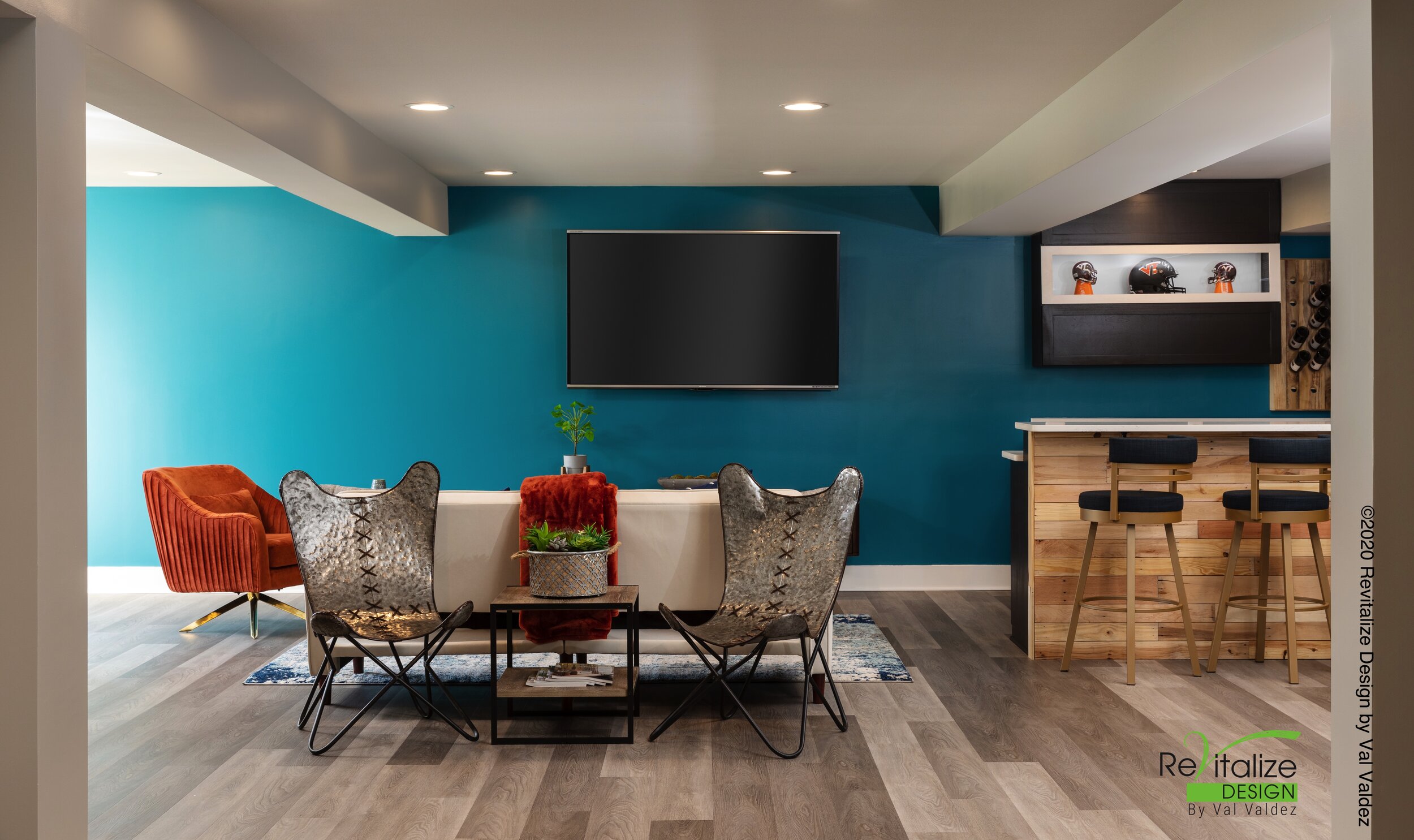
To make this a fun space for the whole family I introduced a vibrant cerulean wall color to unite the two ends of the long room with an exciting energy. Splashes of orange furniture and decorative items tie in the client's affection for their alma mater, and bright abstract wall art ties it all together. The doors to the media room were jazzed up with a deeper hue of the walls and the sleek nickel door lever is a striking contrast that draws one inside.
See more photos below.
The recreation portion of the basement plan has 4 zones: bar, TV lounge, conversation lounge, and play space, each with its own appeal allows family and guests to visit and mingle. As guests enter the basement they are greeted by the bar and invited to lounge in the adjacent TV seating area. See more photos below.
Interior design is about
creating solutions.
An otherwise-obtrusive column in the middle of the room is used to define a grouping of 4 arm chairs where friends can enjoy sips and exchange stories.
The billiards table is housed at the far end of the room leading to the media room. See more photos below.
Scope: My client asked for a media room with 3 TVs; keep the existing carpeting; and any ideas I had to make it a cool space. (click to see video).
Design Solution: My initial reaction was to address the elephant in the room - the huge bulkhead in the ceiling located at the front door spanning from right to left. Most finished basements have these unsightly bulkheads and my goal was to integrate it, to embrace the bulkhead and give it a purpose in the room. How did I do this? Ironically, by ADDING TWO MORE BULKHEADS which created a cozy cove lighting feature that encompasses the seating area. This is what I LOVE about being an interior designer, finding creative solutions that are cool! See more photos below
I designed a plan that makes the bulkhead in the ceiling a focal point, rather than an eye soar. The two newly fabricated bulkheads house LED lighting that change color to create a fun moody ambience. The bulkheads lead to the wall of TVs where a chevron-patterned wallpaper and a custom-made floating media console, that also sheds light below it, creating a dreamy environment proper for watching movies and gaming. See more photos below.
Another Revitalize Design Wake-Up Call!
This dramatic before-and-after photo demonstrates how interior design plans come to life. The key to create fun, functional, and dramatic spaces is in the brainstorming, drawings, and collaboration of a marvelous team.
See more photos below.
Photo credit: Christy Kosnic Photography


